Xert Performance Management Chart (XPMC): A visual representation within the Xert platform that displays various metrics to help athletes track their training progress and performance.
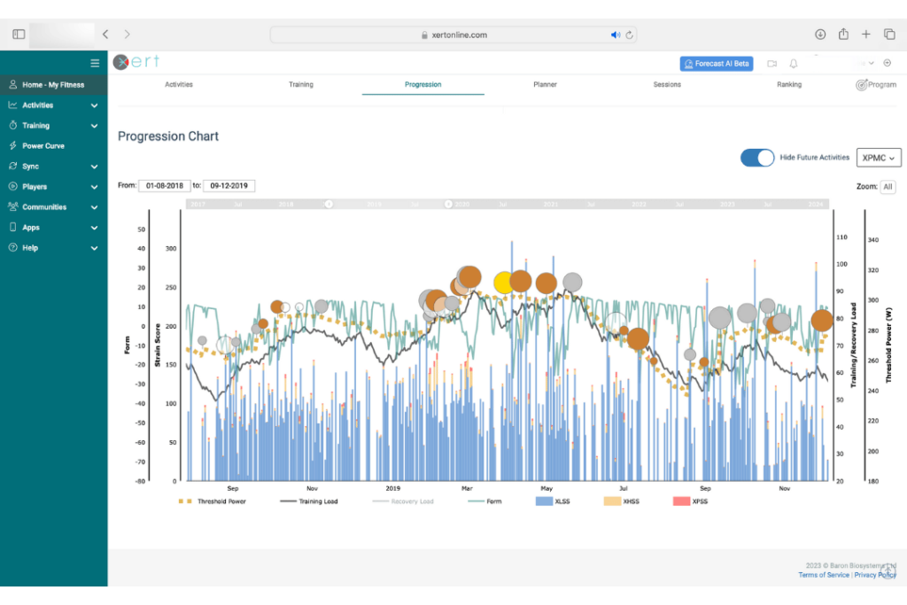
The XPMC typically includes the following components:
- Training Load: The solid black line represents the cumulative stress imposed on the body during training sessions over time. It is often quantified using metrics such as Xert Stress Score (XSS) or Training Load (TL).
- Recovery Load: A measure of the recovery required to return the body to a balanced state after training stress. This metric is hidden by default since Xerters don’t need to keep track of Recovery Load directly. Xert will summarize how much recovery you need and simplify this by using Training Status and Form.
- Form: The multicoloured line indicates your training status over time. Form is derived from the balance between training load and recovery load.
- Daily XSS (Xert Strain Score): The ‘Matchstick‘ for each activity reflects the strain or stress placed on each of your 3 energy systems during activities & workouts, providing a detailed view of daily training intensity. Blue corresponds to low XSS, Orange corresponds to High XSS, and Red corresponds to Peak XSS.
Additionally, the XPMC also includes the following supplementary components for added context:
- Threshold Power: Displays an athlete’s Threshold Power level, a key metric used in performance assessment and training intensity prescription.
- Breakthrough Activities: The circles found in your XPMC highlight specific activities where you achieved significant improvements or breakthroughs in performance, helping to track progress and performance milestones.
Overall, the Xert Performance Management Chart serves as a comprehensive tool for athletes to monitor their training load, recovery status, form, and performance metrics, providing valuable insights to optimize training strategies and performance outcomes.