This post will help a new Xerter interpret their power data from each ride, run or activity. This can be a daunting task, given the constant increases in sophistication of training tools and new developments from training science every year. But it doesn’t need to be! Xert exists to deliver a system with the simplicity to be understood by everyone, yet still delivering the depth & sophistication to appeal to even the most well-read training science junky!
Before we get started, there may be a few new terms that you’re unfamiliar with throughout this post. At any point you can click on these highlighted terms to see the Glossary for a full definition.
Let’s get started analyzing an activity…
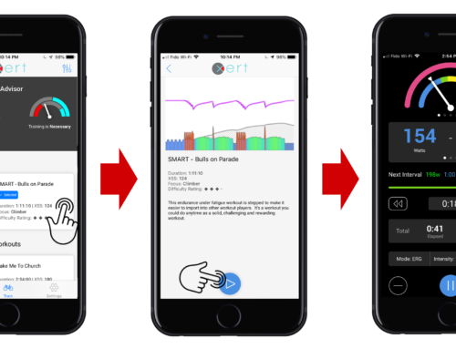
Having done the initial setup one of the first things you may want to do is to view and understand the many bits of information provided when Xert analyzes an Activity. On the left side menu bar click on Activities > Dashboard to see your activities. You can also access the dashboard by selecting the Activities tab from the My Fitness page.
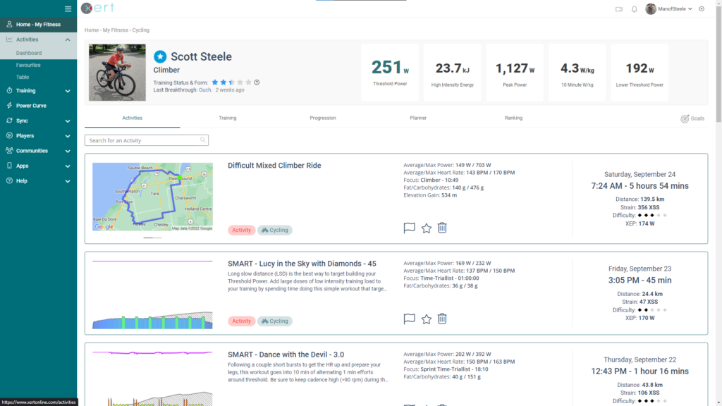
You can open an activity by clicking on the name of the Activity you’d like to review. By default, Xert will title your rides based on the difficulty, specificity, and focus of the ride (e.g. Hard Mixed Rouleur Ride, Moderate Polar Time Trialist Ride, etc.). If you prefer, you can rename your activities and add descriptive notes by clicking on the pencil icon by the title and description, respectively.
Activity Details Header
To mark an activity as a favorite, which Xert can recommend as training in the future, click the ‘Star’ Icon by the title. If there was incorrect data, or if you wish to exclude a ride as a Breakthrough or Near-Breakthrough, click on the ‘Flag’ icon by the title.
In the top right-hand corner of the activity details page, you will find options to share the activity, download a copy of the original .fit file, or delete the activity. Along the activity header you will also see your weight – click the pencil icon to edit. You will also see your Training Status – the colored stars – at the start of the activity, the overall activity Focus, Maximal Effort Time, and the Difficulty Rating of your activity. These are briefly explained below, but click on the respective link to read more:
- Training Status: Represents your Training Load & Form
- Focus: Represents the intensity of your activity & correlates with the various Athlete Types. For example, a 5:00 activity focus corresponds with a Breakaway Specialist athlete type.
- Easy/Endurance activities typically have relatively longer focus duration (>12:00).
- Activities with hard efforts (group rides, races, etc.) typically shorter focus (3:00-12:00).
- Activities with short, all-out sprints often have a very short focus duration (1:00-2:00).
- Maximal Effort Time: represents how much time you spend at or near MPA
- Difficulty Rating: As the name implies, this captures the difficulty of your activity
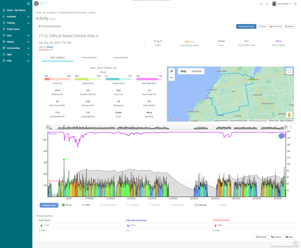
MPA Analytics
In the “MPA Analytics” section you can see the main descriptors of your activity in numbers. Along the top, you’ll see four bars that indicate your average & maximum Power, Speed, Cadence, & Heart Rate. The bar helps depict the range of the data, as well as how closely the average value was to the max.
Below that, you will see important Xert parameters such as Strain, Equivalent Power (XEP), and Strain Score (XSS). On the right is your GPS map, for outdoor activities.
Towards the bottom of the page, you will find the MPA chart. We have kept the chart as clean as possible for clarity by only showing power (multicolored line), Maximal Power Available (MPA) (magenta) and Difficulty (grey shaded area). To see other data, like HR, Speed, or Cadence, click on them in the legend at the bottom of the chart. You can move your graph over the MPA chart and the the map will display your location during that specific effort.
Curious what the different colors mean? Check out this blog post that explains our multi-colored charts!
You can zoom in on a particular interval or section by clicking & dragging on the MPA chart. If you’re using a tablet or mobile phone, tap the graph first, then tap-and-drag to zoom into the desired section or interval. As you zoom in & out of the data, the data in the Analytics section will automatically update to reflect the selected data. Tap the ‘-‘ button in the top right-hand corner of the MPA chart to reset the zoom.
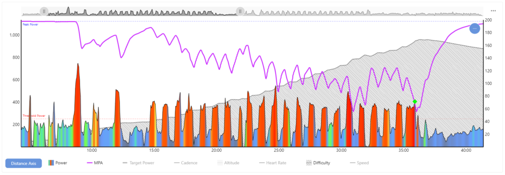
Here we have zoomed in on a set of intervals done outdoors. This particular interval pattern involved approximately 30 minutes of :30 s all-out, with :30 s recovery between each effort… Let’s see what the MPA curve (purple line) is doing:
- When fresh or fully recovered, MPA is equal to your Peak Power (PP), that is, your highest possible power output.
- During each 30 s effort, MPA drops, slightly at first and then at a steeper rate as the athlete fatigues. This is because doing the same 30s effort is much harder and more fatiguing at the end of an interval set than at the start. Your MPA reflects the weakening of your body and its ability to produce power.
- The green diamond represents your very best effort during the whole ride, where your current power is closest to your MPA. If MPA ever drops near or below current power for long enough Xert will see this as a Breakthrough Effort! When you achieve breakthroughs, Xert indicates that your fitness has improved and will automatically update your fitness signature for you. You will then see a bronze/silver/gold medal depending on how many of your 3 signature parameters increased.
- The shaded grey section at the back of the chart represents how difficult your efforts were. As your Difficulty Score rises, the discomfort of your effort increases. Great athletes can generate great power but they can also withstand great discomfort too. Achieving very high difficulty scores is a sign of an athlete that’s trained, tough and ready to compete – a true beast.
If you’d like to know more about MPA you can check out this Pez Cycling News article.
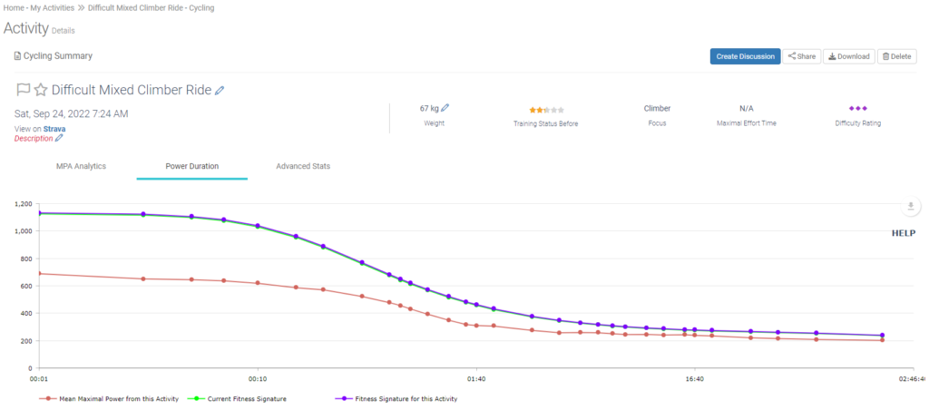
Power Duration
From the ‘Power Duration’ Tab, you will be able to see the power-duration curve for your activity. In short, this shows your highest average power over time (5 s, 3 min, 10 min, etc.). It also shows the highest possible average power over time, given your fitness signature.
Advanced Stats
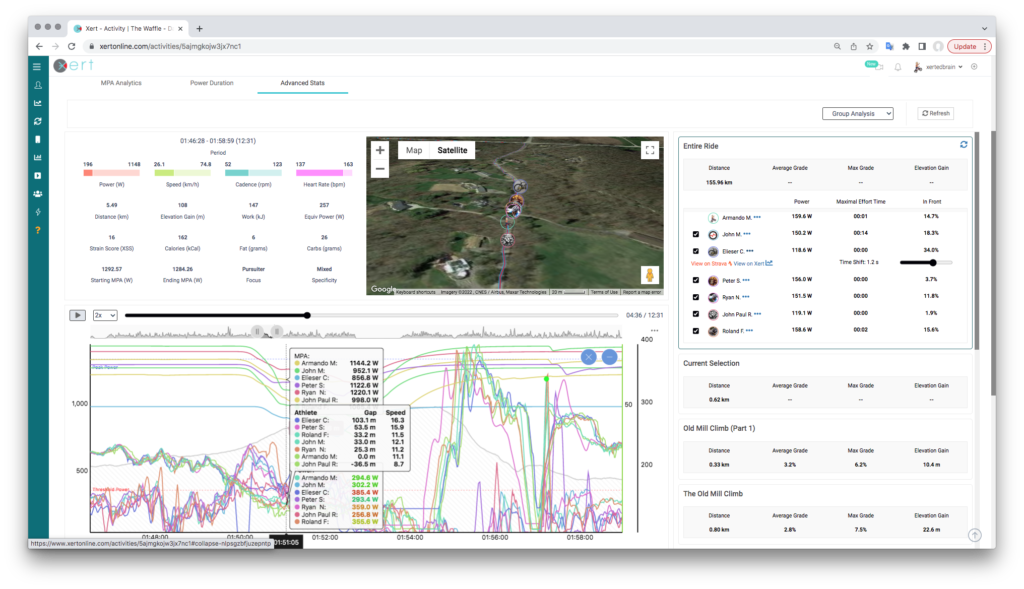
From this tab, you will have access to some more advanced features, such as Strava Segment Analysis, Lap Analysis, and even Group ride analysis. See the articles below to learn more!
Lastly, and for a little more insight into how Xert works, it’s interesting to note that how MPA responds is unique to you and your own unique abilities. The general pattern of how MPA behaves would likely be the same amongst track sprinters, Grand Tour riders, or Ironman triathletes. However, each of these athlete types would have significantly different values for their PP, HIE, & TP – this influences the rate at which each athlete’s MPA changes as they ride above & below Threshold. In this way, Xert’s analysis is automatically and completely customized to you.
If you’d like to know more about how this works there is a separate article on Pez Cycling News further analyzing how different athlete types respond to the same workout.
Happy Training!
P.S. For more posts for new users click the tag ‘Beginner’ tag below.