When reviewing an activity’s data using the Activity Details page, the Power Curve tab reveals the following chart:
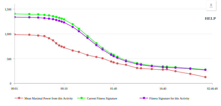
The chart shows 3 lines:
| Colour | Power Curve | Description |
|---|---|---|
| Red | Mean Maximal Power from this Activity | The mean maximal power (MMP) power curve is the traditional way in which activities are evaluated. Here we chart the MMP data for the current activity. MMP is calculated by looking for the highest (i.e. maximal) average (i.e. mean) power in the given activity for the indicated duration. For example in this activity, the highest average 20 minute power (or 20 minute MMP) is 281W. Xert’s MMP algorithm combs through the activity to determine this highest value. In the vast majority of cases, MMP values do NOT represent your highest possible value over the given duration. See the glossary entry on Power Curves for an in depth explanation. |
| Violet | Fitness Signature for this Activity | The Activity’s Fitness Signature can be use to plot a power curve that would represent the highest possible power over the given set of durations you would technically have been capable on this date. The curve is calculated from your fitness signature and represents a theoretical power curve. It is theoretical because it is impossible to measure your maximal possible power at every duration at a given point in time. Xert use your Fitness Signature to provide an estimate as to what your best would have been had you performed a perfectly paced effort from an unfatigued state on the given day. Xert establishes your Fitness Signature using extraction and your MPA data, where fitness breakthroughs provide feedback in determining your fitness signature. |
| Green | Current Fitness Signature | For convenience, Xert also plots the power curve that is based on your current fitness signature, i.e. what is your power curve as of now. If the activity occurred a few months ago or even a few weeks ago, you may notice a difference between what your fitness was then and what it is now. If the activity was your latest activity, you will likely see both Violet and Green lines overlap which means they are the same. (Slight variations can occur due to Signature Decay and adjustments from Training Loads). |
Using click-and-drag (or tap-tap-and-drag using your finger on mobile devices and tablets), you can zoom into a section of the chart to get a closer look on various regions of your power curve. For example, here we have zoomed in to the 20 minute range in order to compare our 20 minute efforts:
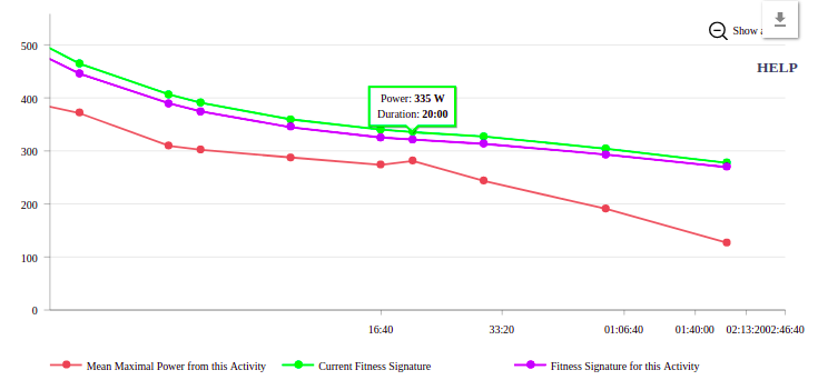
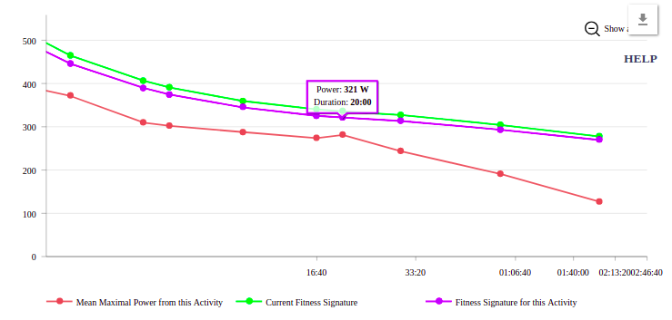
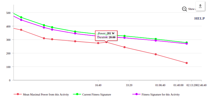
Here we can see and compare our 20 minute power:
| Colour | 20 Minute Power | Description |
|---|---|---|
| Red | 281W | During this activity, the best 20 minute effort that was acheived averaged 281W. Indeed, the effort may have been maximal where you could no longer sustain your 20 minute power but because the effort may have started in a slightly fatigued state or the effort had periods where it wasn’t properly paced, the value 281W isn’t representative of your absolute best. Had you started in an unfatigued state, paced the effort smoothly, and at precisely the 20 minute mark you could no longer sustain your 20 minute power, the average power would have been your best and it would have been higher. |
| Violet | 321W | Had you attempted a 20 minute effort on this day, and had started it in a unfatigued state, paced it perfectly and at precisely the 20 minute mark you could no longer sustain the power, Xert would have predicted 321W would be what would have been you absolute best. (Interesting aside: If you had used the Segment Hunter for an segment that had a duration of 20 minutes, it would have paced you at 321W). |
| Green | 335W | As of the current time (today), if you attempted a 20 minute effort, Xert would expect you to be able to sustain 335W. |