Updated MPA Charts Give You Even More Insight Into Your Activity & Performance
Announcing the new MPA charts! These latest updates will help you better understand your activities, workouts, performances and fitness improvements in a way never done before. Here’s what you’ll see, and how to use them.
Colour-coded MPA charts
Your MPA charts can now be colour-coded to help you better understand your effort. With transitions from grey-to-blue-to-green for all efforts below Threshold Power (TP), and yellow-to-orange-to-red for efforts above TP, and an MPA line that darkens as it comes closer to your current power, you get new insight into your power and fatigue for every second of your activity. This new data will slow the loading of the charts slightly, so we’ve made them an option; without any change in your settings the old/simplified charts will continue to appear in your profile, activities and workouts.
If you’d like to enable this feature, navigate to your Account Settings > Profile and select ‘Enable Advanced Charts’ and SAVE.
If enabled, the new MPA charts will appear in the Activity Details view of an activity, and once it is viewed this way it will also appear in your activity dashboard online and mobile app. Activities that have not been synced since the update will continue to use the default one-colour-power MPA charts.
Workouts will appear in their dynamic colours when opened and viewed in the Workout Designer.
Defining The Colours
To fully understand what you’re looking at with the new colour-coded MPA charts there are two things you should know.
- The new MPA charts use dynamic definitions for the colours above Threshold Power (TP), which means that the specific power they at which they change, will depend on your level of fatigue. However, the definitions of the colours below TP are static and don’t reflect fatigue.
- The colours transition from one defined ‘zone’ to another using gradients, with the pure colour aligning to the definition in the table below, and blends of the colours in between. Where this is most noticeable is with the Red areas…the colour will be red when reaching MPA but it may appear red beforehand; it is in fact simply a dark orange.
| Colour | Definition |
|---|---|
| Grey | Recovery level – generally below 70% of LTP |
| Blue | Lower Threshold Power (LTP) |
| Green | Between LTP & Threshold Power (TP) |
| Yellow | Near or Slightly Above Threshold Power |
| Orange | 5 minute power (based on fatigue) |
| Red | 30 second power (based on fatigue) |
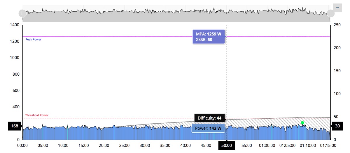
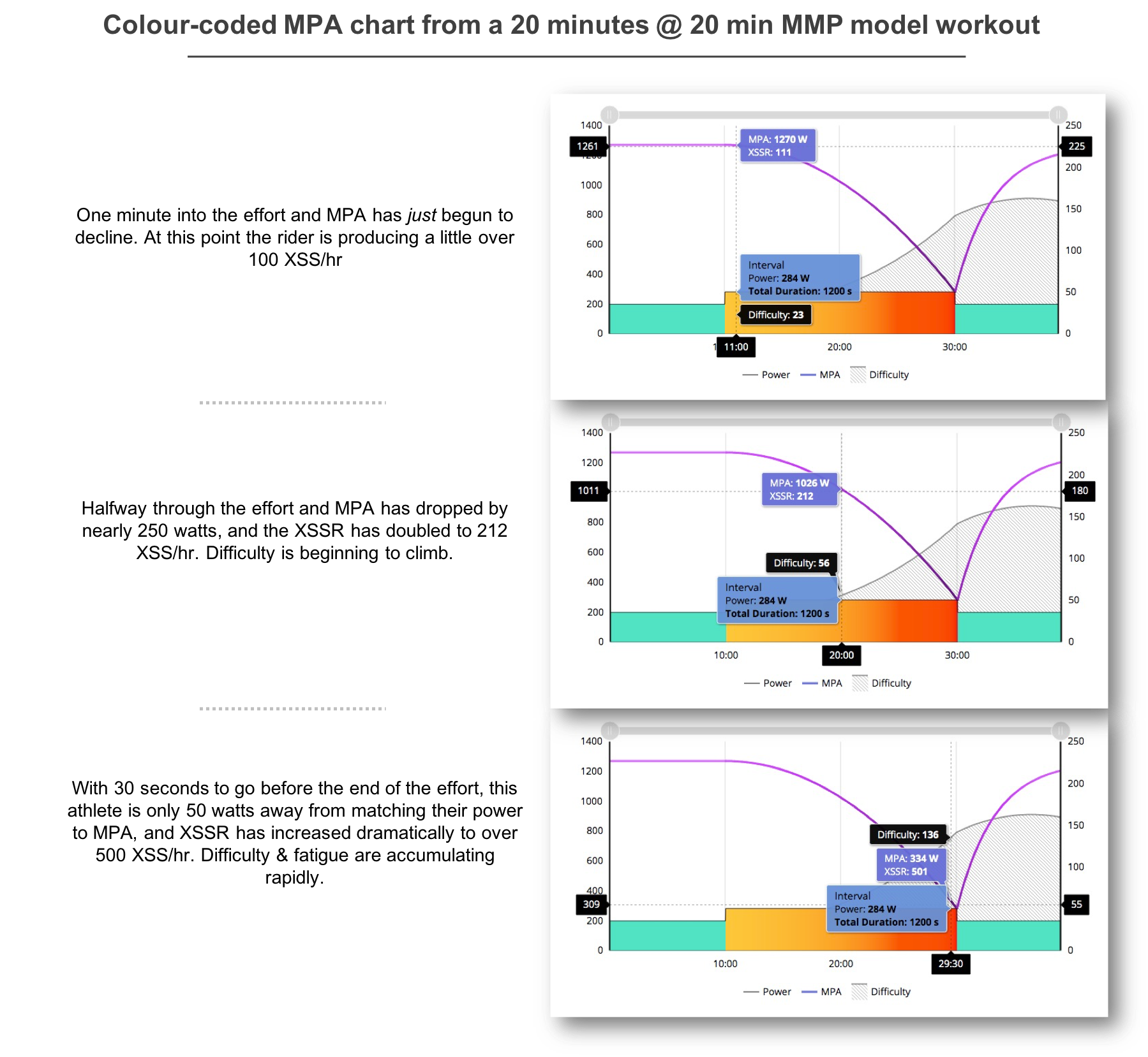
Rolling over the charts with your mouse will reveal existing information as well as some new data. Besides the existing Power, MPA and Difficulty detail (in a workout), and speed, elevation and more in an activity file, the new MPA charts will now show XSSR. This is the rate of XSS (Strain) per hour being applied at any given moment, and – unique to Xert – increases as power approaches MPA.
Below is an example of a 20-minute FTP Test created in the Xert Workout Designer – a 20 minute interval at 20 minute Mean Maximal Power (MMP). You can see how XSSR and Difficult changes throughout this interval, even though power output remains constant.
Tips
Interpreting an activity has been made easier with this new visual representation of your activity. Here are some things to look for, and what they mean.
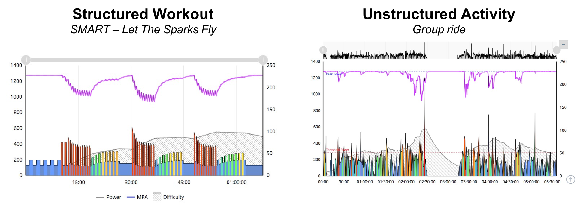
- A typical ‘polarized’ endurance activity, or mostly easy effort with a few accelerations, will appear mostly grey & blue with little-to-no movement of the MPA line. If there are surges or sharp sprints, some orange & red ‘spikes’ will appear.
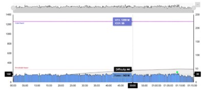
Xert Surplus Seeker ride on Zwift. Mostly grey & blue (recovery & easy) for this rider.
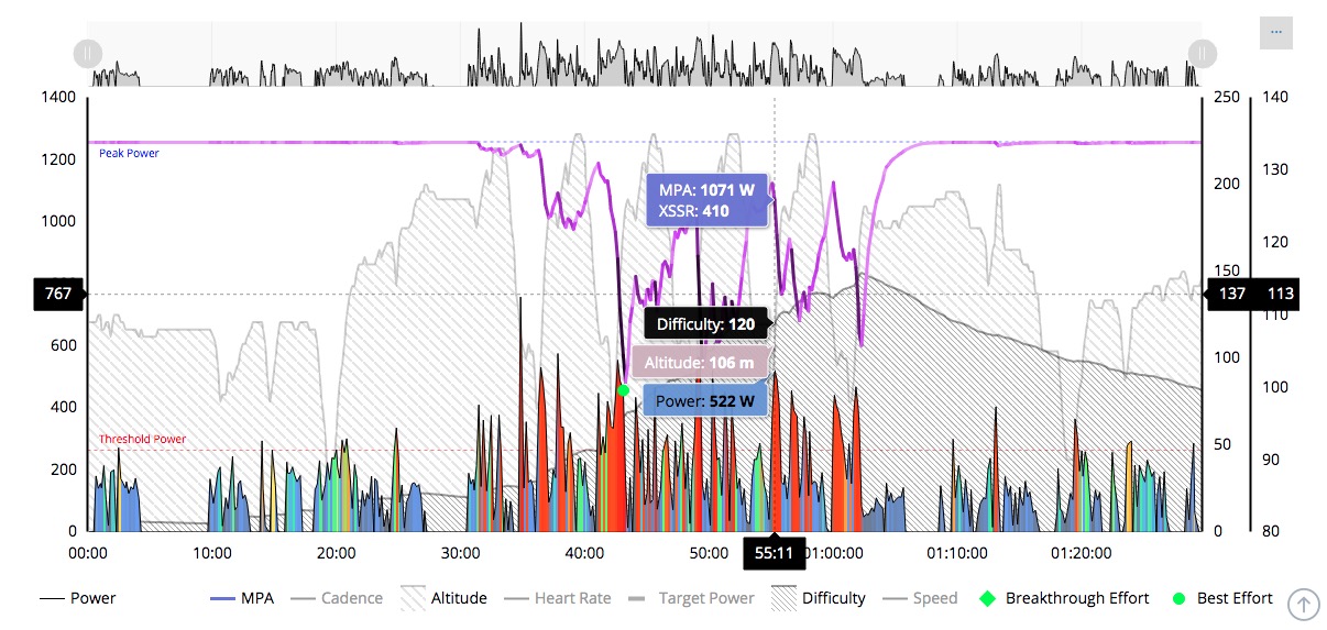
- A steady & constant effort above Threshold Power, like a steady state 20 minute max effort, will show the colours changing from yellow-to-orange-to-red as the athlete draws down their MPA and becomes more fatigued. See 20 minute MMP effort example above.
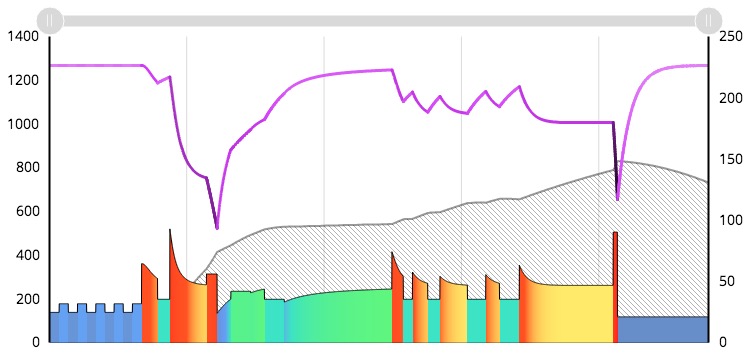
- A typical group ride with some sprints may have a lot of grey, blue and turquoise (transition from blue to green) when recovering and/or drafting, green & yellow areas as during surges with power just below and above Threshold Power, and spikes of orange and red with a sharp drop in a darkening MPA line during sprints.
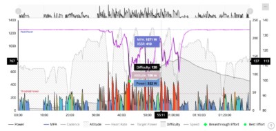
A ‘spirited’ group ride on a hilly circuit. Red & orange as this rider takes a pull or climbs the hill, grey & blue as he recovers in the pack.