Advanced Data Analysis with Xert
New ideas and concepts continue to come to the forefront on how to apply Xert’s revolutionary concepts. Xert’s methods to analyze power data and discover new insights into fitness and performance have never existed before. In this blog post, we’re going to dive into ways you can learn more about your specific performance during a ride, race or workout.
Analyzing your Data After Your Ride
Many athletes are eager to review their data after it is uploaded or synced. You are interested in understanding:
- How well did I perform?
- Is my fitness improving?
- Why did I get dropped / fail to bridge?
- Why did my attack work / fail?
- Why couldn’t I sustain the power I thought I could sustain?
- Where did I get my breakthrough and how was able to do it?
- Am I ready to go to the next level?
- What should I look to improve?
This is just a subset of why we examine our data after our rides. Many times, the answers to these questions are hidden in plain power data. But with Xert, they become lit up, as if with a spot light. Let’s see how Xert does this.
Analyzing the Overall Ride
![]()
The first thing most every user of Xert will do when they upload their activity data, is look for a fitness breakthrough. This activity shows a bronze trophy indicating this activity had a breakthrough. A bronze indicates that one of the three fitness signature parameters has increased. Xert can determine if a fitness breakthrough has occurred at any moment during an activity. This capability is unique to Xert. Opening the Table of Activities shows what changed for this activity:
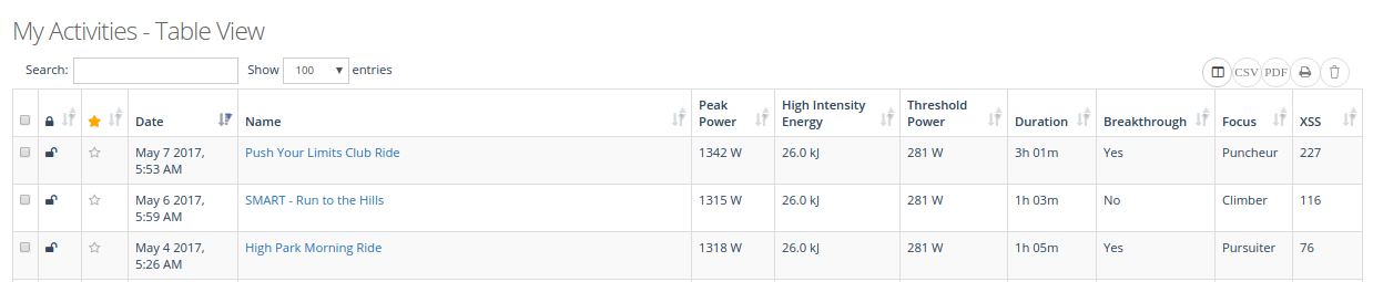
We can see that Peak Power increased and is what gave us the bronze trophy.
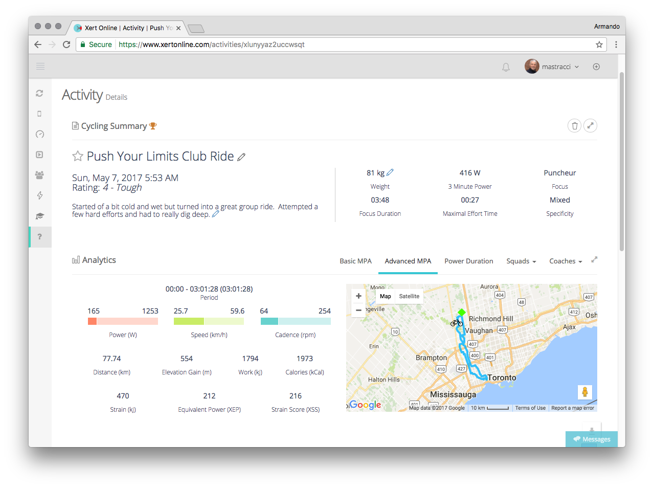
From the Activity Summary, we can see that the Rating for this activity is a 4 – Tough:
![]()
This indicates how difficult this activity was to perform and is measured by looking for a continuous stretch of power that was the hardest during the activity. Ratings above 3.5 are rare for many athletes and seeing this rating on your activity is indicative that you pushed yourself quite hard.
Maximal Effort Time (00:27) tells you how much time you spent at or near you maximum. The greater the amount of time, the more information Xert has to extract an accurate fitness signature. In Xert, this number also corresponds to the size of circle on your Progression Chart.

Focus (Puncheur = 4 Minute W/kg) and Focus Duration (03:48) on the activity indicate that this activity included many harder efforts such that, in total, the activity had put strain on your ability to hold ~4 Minute Power. Again, this metric is unique to Xert and tells you “What aspect of my fitness was most exercised during this activity?”.
![]()
Specificity Rating was Mixed (if you mouse over it, it will show the actual percentage). The higher the Specificity Rating (Pure specificity), the greater the high-intensity strain was near your actual Focus power. A lower value (Polar specificity), means that little high-intensity strain was at the specific power level. Lower specificity ratings often correspond with lower overall intensity activities for this reason. Again, this metric is unique to Xert and tells you “How much did I exercise this aspect of my fitness?” This provides you another dimension to your activities and workouts unavailable elsewhere.
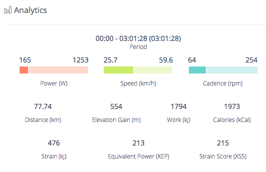
The analytics section initially provides you with a summary over the overall activity. Notable values include Equivalent Power (XEP) which provides an additional perspective of the difficulty of the overall ride and the Xert Strain Score (XSS) which is the value that is used in your Training Loads, Recovery Loads and XPMC. We’ll also refer to this section when as it changes to reflect the zoomed in section on the chart.
Reviewing Specific Efforts
 Although many athletes like to check how well they do on various segments, both in relation to previous efforts and with others, properly comparing one result to another can be difficult since there are often so many other factors involved: Which way was the wind blowing? Was there any drafting? Was the segment started from a fatigued state? Were there any interruptions? Was it perfectly executed? We’re you at your best when you attempted it?
All these questions make comparing one result to another difficult, if not impossible.
This is where using MPA provides an ability to account for many of these uncontrolled elements and compare how well you did. A simple review of the segment that shows power reaching MPA at the end indicates that you properly “emptied the tank” at the very end. The shape of this maximal effort provides some clues as to what happened:
- If your maximal effort rises to reach your MPA, this is usually a sprint or an accelerated effort and likely indicates that you may have left too much until the end. A very slight rise is normal and desired as it is means you’ve given it everything right until the very end of the segment.
- If your MPA lowers to reach your power, this is usually indicative of “hanging on” in an attempt to maintain your speed and power until the end of the segment.
- If your power doesn’t reach MPA, then your effort wasn’t your best and you could have improved with better execution or with better preparation. During high power sprints, gearing may impact your ability to reach MPA. Successively reaching MPA multiple times during a segment can be very difficult this tests hardness and your ability to withstand discomfort. “Don’t go out too fast” is a phrase one hears quite often as it forces efforts to be done with added strain and if a maximal effort is reached, makes sustaining power much more difficult on the athlete.
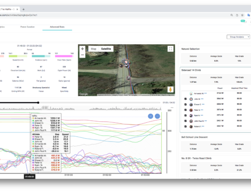
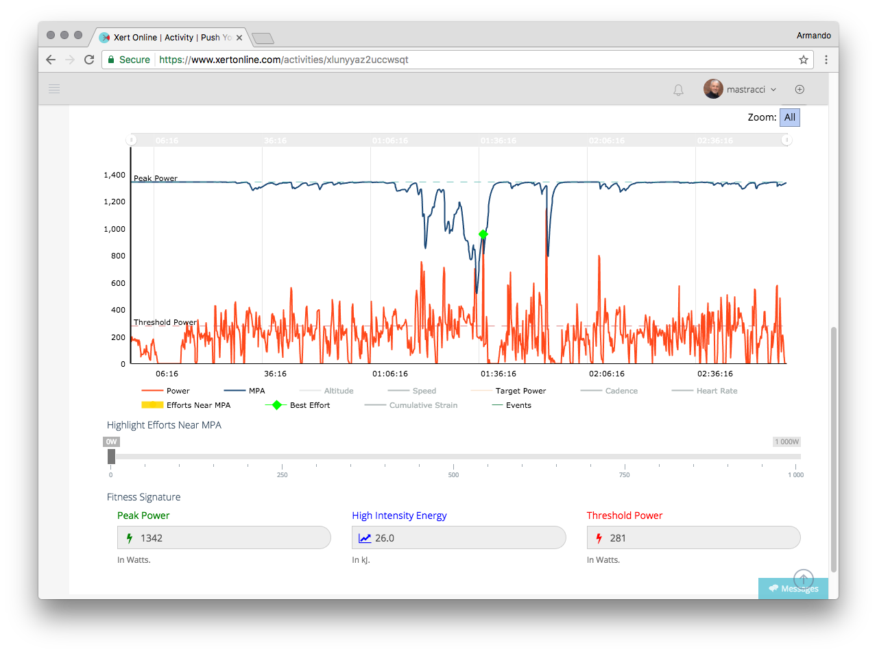
Let’s zoom in on our activity to see if we can get more information on our particular efforts (to show the elevation, click on the Altitude link in the legend below the chart):
The first effort at roughly the 1:35:16 mark, shows that the effort was sustained until it could no longer be sustained. The second effort was an effort to produce as much power as available.
Let’s now zoom in to the third effort:
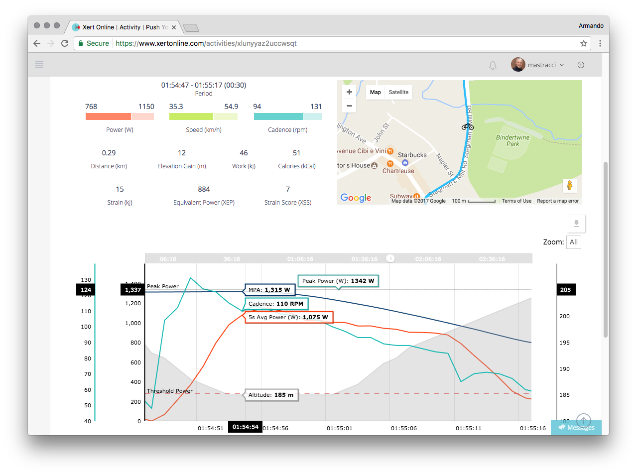
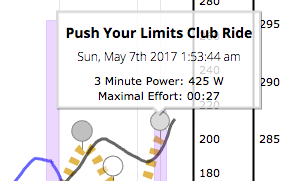
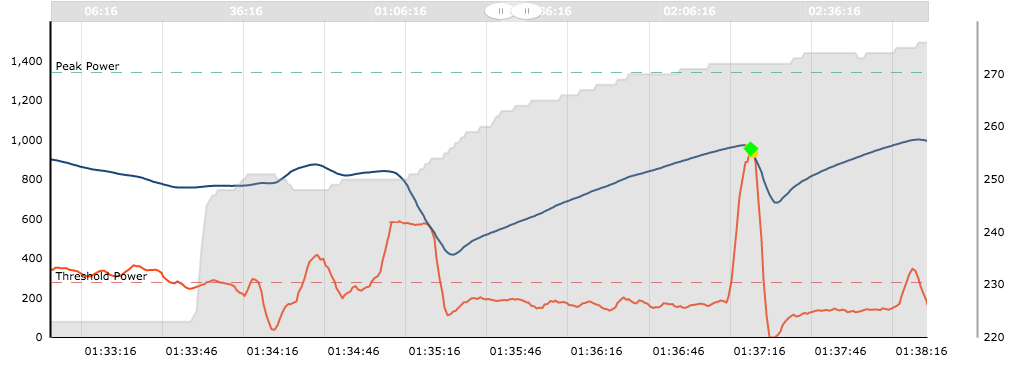
This third effort shows that we came close to reaching MPA but didn’t reach it. We can learn a lot from examining this particular effort. By zooming in, we can see that part of the effort occurred on a flat and then during a short climb. Using Xert, we can also see where on the map this occurred, helping us remember the specific effort. The zoomed in section was for 30 seconds, as shown at the top of the summary and the average power was 768W with a peak at 1150W. Cadence had a peak of 131RPM and averaged 94RPM for the effort (use the Cadence link in the legend). The effort was started in a fatigued state – MPA was 1315W at the start of the effort and declined to roughly 800W by the end. We wouldn’t expect our 30 second power, therefore, to be near our highest 30 second power. Even if we had held MPA for 30s, it would be below the highest we would be capable of since it had started in a fatigued state. Since very many efforts, particularly during race and club rides are initiated in a fatigued state, comparing one effort to another across different activities may not actually provide meaningful information.
So although this was a good effort, we wouldn’t expect this to be our best possible effort.
Why did we not reach MPA? Efforts later in the ride where some long-term fatigue has been accumulated can be more difficult to attain MPA. Also, execution with your best cadence is important, particularly with higher power efforts.
Notably, for those that have been performing our Smart Workouts, you’ll often notice these natural, XSSR-like efforts in your data as in this effort. Matching target power dynamically with fatigue is what is only available in Xert.
What should you be looking to improve?
What would be been an incredible effort on your part may be an easy, if not even a recovery ride on the part of a elite cyclist. It’s what sets them apart, reaching levels of performance and fitness that non-elites cannot reach.
There are several aspects to elite athletes that make them special:
- High Fitness Signatures – Ability to produce very high power
- High Ratings / Hardness Scores – Ability to produce their best power repeatedly, generating high ratings
- High Endurance Capacity – Ability to dig deep after many hours of riding
Improving all of these three is the recipe for success in cycling.
Increasing FTP is the standard scope of improvement most people measure. But remember that fitness is more than just your FTP. Improving not just Threshold Power (FTP) but also seeing improvements in High Intensity Energy and Peak Power is what will give you the capacity to produce and sustain power and all intensities.
Secondly, cycling demands that you produce your best efforts over and over and those that are capable of this are prepared to do what it takes to win. From a data standpoint, you’ll see repeatedly efforts that draw MPA down and keep it down over the activity. This is the definition of hardness in Xert and those that are most successful can demonstrate a capacity to do so that is exceptional.
Lastly, rides and races can be 3, 4 and 5 hours long or sometimes even longer. Being able to produce near breakthrough efforts after spending several hours racing is something that takes years and years of training and a great deal of preparation for the race season. Elite cyclists that have been training and are in the best form for winning, will be able to achieve the same levels of performance at the end of a race as they can do at the beginning. This is seen as the ability to reach MPA later and later into a ride. You can strive to do the same in your training.
Comparing Your Data
If you look at the data from one effort vs. another, it may be difficult to discern a lot of information. Looking at averages and normalized averages helps but these can also mislead, particularly with highly variable riding like in crits, races and group rides. We may be able to see how much power we had produced but we may not readily see how difficult it may have been to produce the power. This information is often why it’s been common for power analysis software to provide a variety of tools to compare one effort or interval to another. There is an need to try and understand the context into the efforts, not just the effort itself.
This is where Xert really stands out. Rather than trying to assess this information indirectly, Xert simply shows this information directly via MPA, allowing you to plainly see how MPA is affecting power and how power is affecting MPA. How much power you generate is important as helps you understand what you did, but MPA is the magic number because it is the precious resource that must be managed and used as effectively as possible.